April 18, 2024
Which chart would you like to show?
Beginners and advanced designers alike get stuck deciding which chart is right for their data. Next time you're stuck, try this chart guide by Damola Ladipo.
Check it out on Tableau Public here. Click the image below for a hi-res version to print.

April 16, 2024
How to Create a Bar-in-Bar Chart in Tableau
April 13, 2024
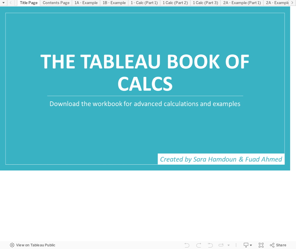
25 Example to Help You Master Calculations in Tableau
How to Create a Proportional Stacked Bar Chart in Tableau
Proportional stacked bar charts are a good way of showing the size and proportion of data at the same time.
April 10, 2024
How to make sense of ANY data set
Demystify ANY data set by answering 5 simple questions:
- When?
- Where?
- Which?
- Who?
- Why?
----------
P.S. Newsletter subscribers get a deeper dive into each of these for FREE when they sign up. Go to andykriebel.com to get yours.
11 Ways to Compare Two Measures
I don't believe in complexity in data visualization. I stick with simple charts when you needs to compare measures to add context.
Tableau workbook here.
April 9, 2024
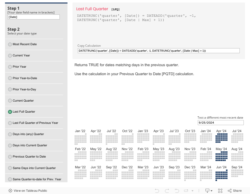
The Ultimate Tableau Date Calcs Cheat Sheet

How to Create a Floating Bar Chart in Tableau
A floating bar chart is similar to a Gantt chart, except it shows the range of two data points instead of two dates.
April 8, 2024
How to Create an Enclosed Dot Plot in Tableau
An enclosed dot plot is similar to a barbell charts except the line connecting the dots surrounds the dots.
April 7, 2024
How to Create a Barbell Chart in Tableau
A barbell chart is a dot plot that shows two or more points and also connects those points to display the range.
April 6, 2024
How to Create a Histogram in Tableau
A histogram visualizes the distribution of data over a continuous interval. Each bar represents the frequency at each bin.
18 Ways to Visualize Bar Charts in Tableau
The SECRET to never choosing the wrong chart...the Bar Chart! Here are 18 options for your next bar chart.
Tableau tutorial and workbook here.
How to Create a Heatmap in Tableau
A heat map is a good way of showing the patterns between 2 categories of data. They use color to encode the intensity of the relationships in the matrix.
April 2, 2024
April 1, 2024
#WatchMeViz: Can viral infections be cured with antibiotics?

March 27, 2024
8 Reasons Power BI isn't "FREE"
What are joins?
Fundamentals of Joins by Andy Kriebel
March 11, 2024
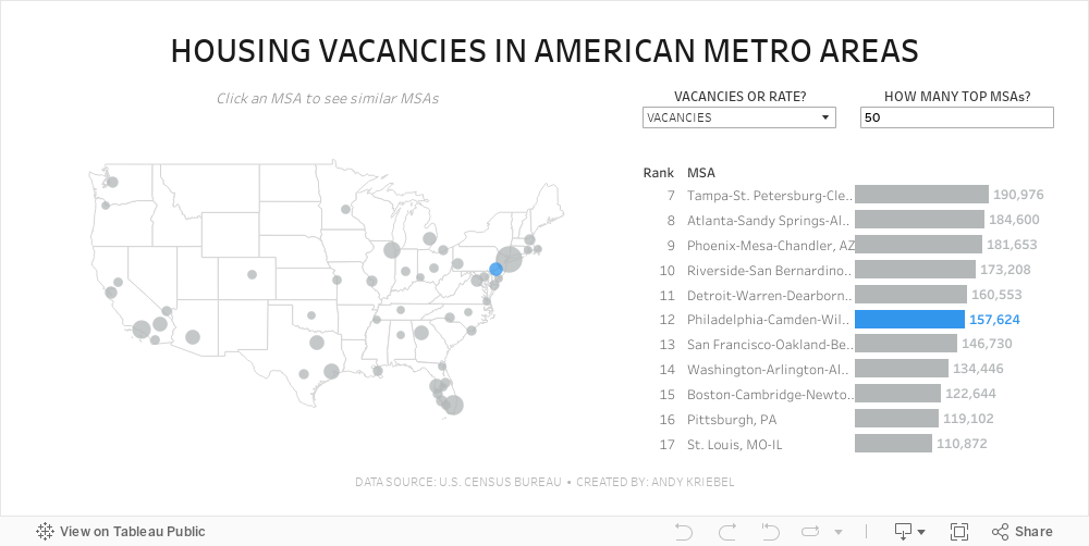
#MakeoverMonday 2024 Week 11 - Housing Vacancies in America

- Size - 1000x475
- Max 4 containers; no tiled containers allowed
- Filter out Alaska, Hawaii and Puerto Rico
- Clicking on a MSA in the map highlights the MSA in the map and bar chart and changes the MSAs that are displayed in the bar chart
- The bar chart shows the rank of the MSA for the metric selected.
- There should always be 11 bars (though I didn't test the lowest rank).
- The label on the end of the bar and in the map reflect the formatting of the measure selected (i.e., either whole numbers or a percentage to one decimaal).
- Include an option to change the measure and to change the number of MSAs on the map.
- Create a mobile view
- NO LODS!
March 8, 2024
Visualizing Time Series Data in Tableau
Last night I was invited to speak at the Chicago Tableau User Group about visualizing time series data. Other than spatial data, time series data is my favorite to visualize.
There seem to be endless methods for making time series data useful for analysis. Check out this video for 60ish ways to visualize time.
I had a 20 minute slot to present and, of course, I ran over time. I seem to do this with every session I run lately. Be it training for Next-Level Tableau, presenting at events, or running a livestream, I get into a groove and don't want to stop.
I was able to create 14 vizzes in 20+ minutes. I added an extra in this workbook to make the dashboard format nicely.
Click on the image below to download the workbook and dissect it. Get the data here to follow along.
Have fun!


